Senior Product Designer
Live Guide
A cross-platform live discovery experience that helps viewers scan, filter, and move through a dense TV catalog.
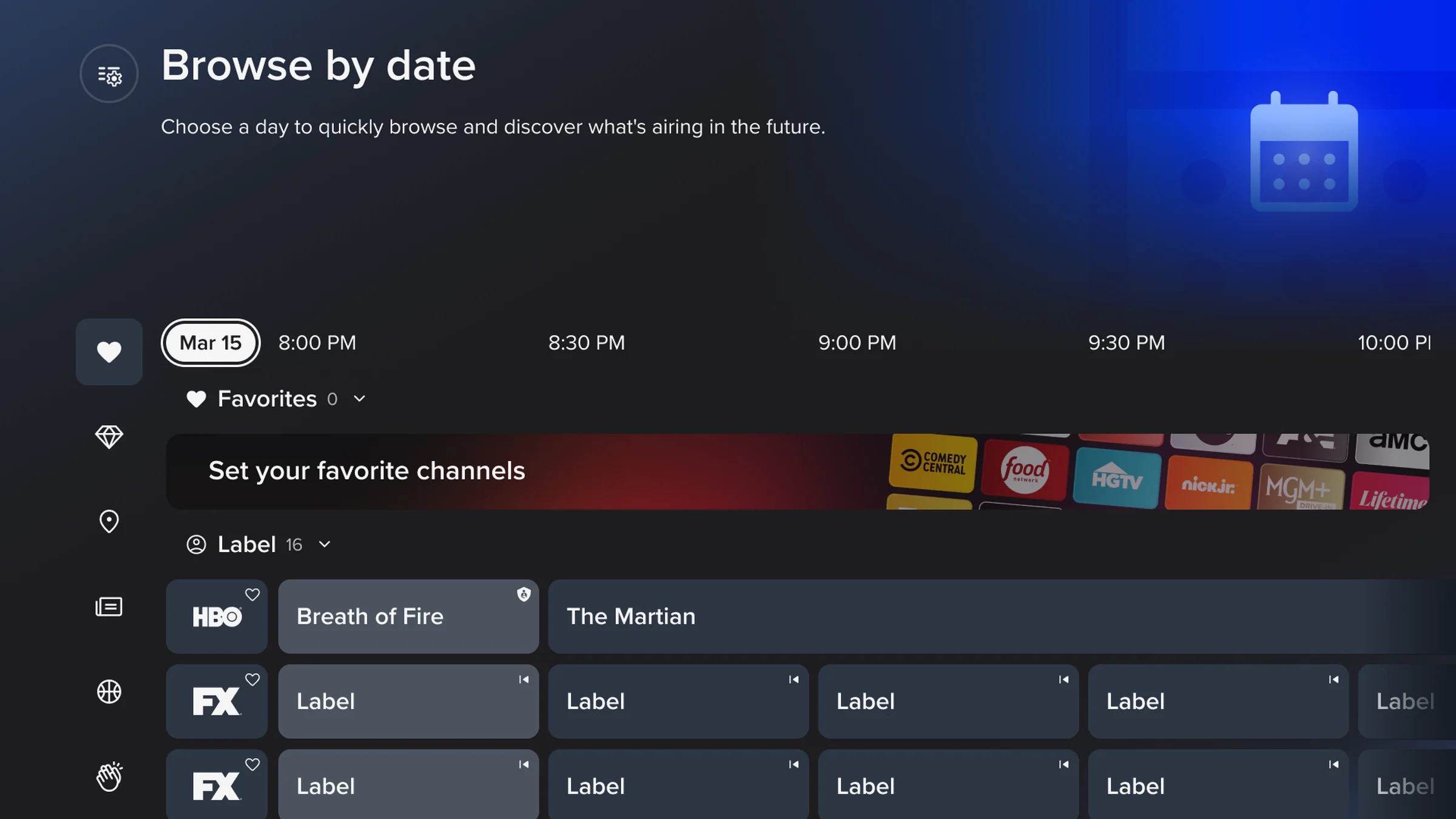
Snapshot
Sling offers a large live TV catalog, which is valuable but hard to navigate when everything competes for attention. The guide redesign focused on helping users find something worth watching without feeling buried in channels, rows, and metadata.
Problem
Users had different discovery modes. Some wanted to channel surf, some wanted genre-based browsing, and others arrived with a specific show or sport in mind. The existing guide placed too much weight on a single browsing model.
My Role
I led design direction for the Live Guide, owning the information architecture, category model, remote navigation, cross-platform layouts, interaction behavior, and the connection between discovery and playback. I partnered with product, research, engineering, and other designers across the broader viewing experience.
Key Decisions
Support multiple discovery paths
The redesign treated channel browsing, genre exploration, and personalized discovery as related paths rather than forcing every user through one structure.
Make scanning easier
Visual hierarchy, spacing, and content density were tuned to help users make fast decisions. The goal was to reduce the effort required to understand what is on now and what is worth opening.
Respect input differences
Touch, mouse, and remote input each shape how discovery feels. The design patterns were structured to preserve consistency while adapting interaction details for each surface.
Outcome
The redesigned Live Guide launched across TV, browser, tablet, and mobile in Q3 2026. Research and post-launch evaluation focused on category comprehension, placement, sorting, iconography, metadata, layout, and readability. Broader outcome claims will be added only when that evidence is available.
Reflection
Large catalogs do not become easier by showing more at once. They become easier when the interface makes meaningful choices clearer, faster, and more forgiving.